As an ecommerce business owner, you're always on the lookout for ways to optimize your website and drive more sales. One powerful tool in your arsenal? Exit-intent pop-ups.
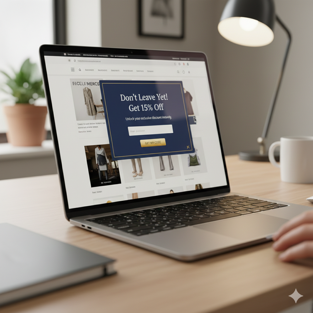
Exit-intent pop-ups are a type of on-site message that appears when a visitor is about to leave your website. They're designed to capture the attention of these "abandoning" visitors and give them a compelling reason to stick around - whether that's a discount, a piece of valuable content, or something else entirely.
When executed properly, exit-intent pop-ups can be an incredibly effective way to reduce cart abandonment, grow your email list, and boost your overall conversion rates. But get them wrong, and you risk frustrating your visitors and driving them away for good.
In this in-depth guide, we'll explore the 6 key pillars of highly effective ecommerce exit-intent pop-ups. By the end, you'll have a roadmap for creating pop-ups that actually move the needle for your business.
Pillar 1: Never Show Pop-Ups on Page Load
One of the cardinal sins of exit-intent pop-ups is showing them as soon as a visitor lands on your site. This is a major no-no.
"The very first thing that we're gonna cover here or one of the many rules that I'm gonna cover for exit intent pop-ups is first and foremost never show them on a page load and let me show you an example of what I mean by that. Gab.com for example, boom, the very first thing we see is a pop-up and this is what you never ever want to do because the visitor haven't even landed on the site, they don't even know, they haven't even even looked at the site yet and boom this pop-up says hey perk alert get 25 off 25 off of what I don't even know what I'm looking at first."
The problem with showing pop-ups on page load is that it interrupts the user's experience and creates immediate friction. Visitors haven't had a chance to engage with your site, understand your offerings, or build any kind of relationship with your brand. Bombarding them with a pop-up right away is a surefire way to frustrate and alienate them.
Instead, the whole point of an exit-intent pop-up is to capture the attention of visitors who are already on the verge of leaving your site. By waiting until they make an explicit move to exit, you're much more likely to grab their interest and convince them to stick around.
As Aleks puts it, "it only should show when a person moves their cursor away to try to which is an indication of them trying to exit the website. So as soon as they move the cursor upwards toward the browser top bar then that's when we want to show the exit intent pop-up."
Pillar 2: Offer a Compelling Incentive
Once you've nailed down the timing of your exit-intent pop-up, the next key is to make sure you're offering visitors a compelling reason to engage. As Aleks explains, the most effective pop-ups provide a clear incentive - typically in the form of a discount or other valuable offer.
"Whenever you show a pop-up an exit intent pop-up the reason why would somebody typically leave the site is because I mean there could be many reasons but for most people it's typically price issues right the number one typically like don't take my word for it but typically on all of our post-purchase surveys that we do with our customers and stuff no matter what you do price is going to always going to be objection when it comes to shopping and most people check multiple websites like uh price comparisons at least four to five different websites so anyway it's safe to assume that anybody would like a lower price most people will like a lower price to the item they're looking at right. So that being said what you want to do is you want to incentivize people to stay when they try to exit you show this pop-up and say oh hold on are you leaving leaving so soon here 10 off get 10 off and maybe that will help you right I'm you're not you're not going to use that exact same words but hey leaving so soon hold on uh put your email and get 10 off your order or whatever right."
The key here is to offer something that's genuinely valuable to your visitors. A measly 5% discount or a generic "sign up for our newsletter" offer simply won't cut it. You need to dig into your customer data, understand their pain points and motivations, and craft an incentive that will make them think twice about abandoning their cart.
Aleks notes that in his experience, anything more than a 10% discount doesn't necessarily convert much higher. So a 10% off coupon code or free shipping offer can be a great place to start. But you can also get creative with other types of incentives, like a free piece of valuable content (e.g. a PDF guide) or a chance to win a prize.
The key is to test different offers and see what resonates best with your audience. And remember, the goal isn't just to get the visitor to engage with the pop-up - it's to convert them into a paying customer. So make sure your incentive is directly tied to driving that final sale.
Pillar 3: Display the Discount or Offer Immediately
Once you've hooked a visitor with a compelling incentive, the next step is to make it as easy as possible for them to take advantage of it. And that means displaying the actual discount or offer right there on the pop-up, rather than making them jump through additional hoops.
"What you want to do is show the discount code right here hey thank you for signing up or whatever here's your 10 discount code use this at checkout something like that but whatever you do you want to show this right here on the spot that's how we get uh roughly around 20 and 21 of the people that give us their email to immediately convert by showing them the discount right here on the spot."
As Aleks explains, the alternative - directing visitors to check their email for the discount code - is a major mistake. It creates an unnecessary extra step that will likely result in a lot of lost conversions.
Instead, you want to make it as frictionless as possible for visitors to redeem your offer. Display the discount code or other incentive right there on the pop-up, and give them a clear call-to-action for how to use it (e.g. "Enter this code at checkout for 10% off").
This approach has proven to be incredibly effective for Aleks and the Build Grow Scale team, with around 20-21% of pop-up subscribers converting on the spot. By removing any extra steps or barriers, you're maximizing the chances that visitors will follow through and make a purchase.
Pillar 4: Ask for the Minimum Required Information
Another key to creating effective exit-intent pop-ups is to keep the information you're asking for as minimal as possible. As Aleks points out, many ecommerce businesses make the mistake of asking for too much data upfront.
"What do I mean by that this is asking me for email and then for gender which by the way many people are not comfortable I think based on a survey done by B-Mart Institute I think roughly 35 percent of the people said they would not give out their gender online that gender information so one this is causing friction from that point of view because it's sensitive and 2 it's more than you need right. You want to have it as minimal you won't ask for minimal amount of information which is the just the email you can some people ask for name but you don't necessarily need to."
The goal with your pop-up should be to capture the bare minimum information needed to follow up with the visitor and deliver on your incentive offer. In most cases, that's just the visitor's email address.
Asking for additional details like name, gender, or phone number may seem like a good way to personalize your marketing efforts. But it also creates unnecessary friction and can turn visitors off from engaging with your pop-up in the first place.
Keep it simple - email address only. You can always collect additional information later on, once you've built a relationship with the visitor and they've had a chance to experience the value you provide.
Pillar 5: Explain Why You're Asking for Sensitive Information
That said, there may be times when you do need to collect more sensitive information from your visitors, like their gender or phone number. In those cases, it's crucial that you explain why you're asking for that data.
"Asking for sensitive information is okay and not just here anywhere especially in the checkout as long as you tell people why you ask them that information like why do you want me to know whether I'm a man or a woman okay was the point if you clarify with a little microcopy line in context of that selector right someone somewhere over here with a little asterisk and a smaller text explaining hey uh we need this information to personalize our uh marketing emails or whatever to specifically to use something like that that will significantly increase their take rate on this."
By providing clear context around why you're asking for certain information, you can help put visitors at ease and increase the chances that they'll actually provide it. A simple line of microcopy explaining the purpose can go a long way.
This principle applies not just to your exit-intent pop-ups, but to any data collection touchpoints on your site - from checkout forms to account registration pages. Transparency and clear communication are key to building trust and reducing friction.
Pillar 6: Keep Mobile Pop-Ups Unobtrusive
The final pillar of highly effective ecommerce exit-intent pop-ups is ensuring that they're optimized for mobile devices. As Aleks explains, one of the biggest mistakes businesses make is creating pop-ups that take over the entire mobile screen.
"The last thing I want to point out when it comes to the exit intent pop-ups on how to optimize them is to let me switch to mobile to never have them show like cover the whole screen on mobile like this. This is never a good idea not just with pop-ups but even with a product images zoom on mobile you never want to cover the whole screen because people feel like they landed on a completely different page and then they typically hit the back button and that takes them off the site especially if this showed as it did here on a page load."
Instead, your mobile pop-ups should be designed to be unobtrusive and maintain the overall context of your website. They should appear as a smaller overlay or modal that doesn't completely take over the screen.
This helps ensure that visitors don't feel like they've been transported to a completely different experience, which can lead to high bounce rates as they frantically try to find their way back to your site.
By keeping your mobile pop-ups compact and integrated with the rest of your page, you're creating a seamless user experience that's more likely to capture attention and drive conversions.
Putting It All Together
Exit-intent pop-ups can be an incredibly powerful tool in your ecommerce optimization toolkit. But to truly unlock their potential, you need to get the fundamentals right.
By following the 6 pillars outlined in this guide - from timing your pop-ups correctly to offering compelling incentives to optimizing for mobile - you can create exit-intent experiences that engage your visitors, grow your email list, and drive more sales.