If you're an ecommerce business owner, your popup submit rate should be at least 4.65%. But if you're reading this, yours probably isn't even close. The truth is, the top 10% of popups convert at an astounding 19.77% - that's five times higher than the average. And that's the number you should be aiming for, because popups are the foundation of your entire email and SMS marketing program.
The submit rate of your popup is directly related to the revenue you make from your welcome flow. The more people you have joining your welcome flow, the more revenue you'll generate. And of course, your popup submit rate also reflects how fast your list is growing, which affects the revenue from your email and SMS campaigns.
In this in-depth blog post, we'll break down the most common mistakes killing your popup conversions, as well as some advanced psychological factors that are often overlooked. By the end, you'll have a step-by-step action plan to audit your current popups and fix what's not working. Trust me, you don't want to miss this.
Mistake #1: Popups at the Wrong Time
You've seen it before - a popup that smacks you in the face the second the page loads, feeling like something is shouting at you before you've even had a chance to say hello. On the other end of the spectrum, popups that show up too late and miss the opportunity to convert a new visitor into an email subscriber altogether.
So, what's the sweet spot? Aim to show your popup 5 to 15 seconds after the page loads. Even better, layer your triggers - use a time delay combined with scroll depth and exit intent. Why? Because not every visitor behaves the same. Some scroll fast, some leave quick, some browse forever. You need different triggers to catch each one.
A quick tip: combine scroll percentage plus exit intent. This will equal higher conversions and better user experience.
Mistake #2: Same Popup for Everyone
This is a very common mistake, and yet so easy to avoid. Imagine you're a returning customer on a brand's website, already on their email list, and then BAM - a popup asking you to join their email list for 10% off. It's like offering someone a menu when they're already halfway through their dessert.
The problem is that most brands treat every visitor the same. New visitors, loyal repeat buyers, someone who's visited three times this week - they all see the exact same popup. Here's the fix: treat people like real humans with different needs.
- New visitors need trust and context before converting.
- Returning browsers need urgency or exclusivity.
- Subscribers don't need to subscribe again.
- Customers care about loyalty, not entry discounts. When we help clients segment their popup strategy this way, the results speak for themselves. People stop seeing popups as interruptions and start seeing them as personalized experiences.
Of course, this will also be impacted by cookies. Even if you have the proper settings in the popup, if a customer is visiting from a new device or browser, your popup won't recognize them. But let's control what we can control and get our settings right for all of our live popups.
Mistake #3: Ignoring Mobile Users
On average, about 68% of your traffic will be on mobile. But most popup tools are still designed for desktop. As a result, popups look like this: tiny fonts, hidden close buttons, forms that don't fit. But it's deeper than bad formatting - it's about mobile behavior.
Mobile users are distracted. They're multitasking. Sometimes they're literally walking while shopping. Your popup has to work with that, not against it. Here's the mobile formula that works:
- Single column layout
- Large thumb-friendly buttons
- Maximum 12 words of text
- A close button in the top right corner Start mobile-first, then adapt for desktop - not the other way around.
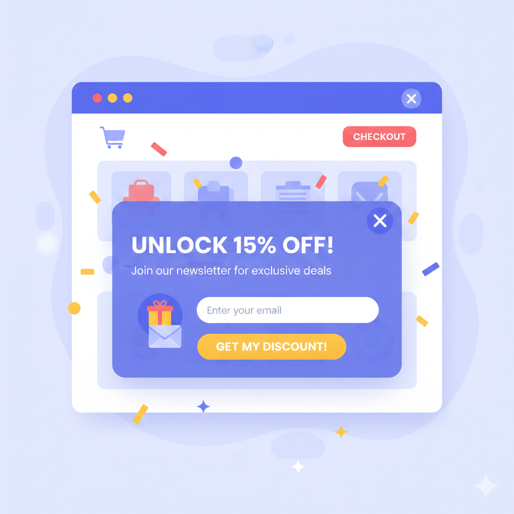
Mistake #4: Complicating Your Message
Most brands try to cram everything into their popups - a headline, multiple offers, multiple CTAs, a product photo, and a 200-word story. Then they wonder why users just hit the "X" button.
Your popup is not a brochure, it's a conversation starter. Top-performing brands keep it simple:
- One clear message
- One clear CTA
- On-brand visuals
- Only one ask per popup stage or step Design matters too. If your popup looks like it was built on a different planet than your website, it breaks trust instantly. Keep the color palette and fonts consistent to make the popup feel like a natural part of your site, not an interruption.
Mistake #5: Showing the Same Popup Over and Over
Here's what brands get wrong: most show the same popup to the same person over and over. If someone doesn't convert the first time, they blast them again the next day, and the next, and the next. But here's what really happens in your potential customer's brain:
-
First popup: "Hm, interesting."
-
Second popup: "I saw this already."
-
Third popup: "This is annoying."
-
Fourth popup: "I'm never buying from this brand." This is the mere exposure effect, but in reverse. Repetition without variation equals instant fatigue. The fix? Smart frequency capping and progressive offers:
-
Visit #1: Welcome discount
-
Visit #2: If no conversion, add social proof
-
Visit #3: Urgency or limited-time offer
-
Visit #4: Exit intent only
-
After that, a 30-day cool-down Simple, strategic, and respectful.
Advanced Mistakes to Avoid
Now let's dive a little deeper into some advanced psychological factors that are often overlooked:
Pattern Interrupts
Popups can capture attention or kill it. Trigger them based on behavior, scroll percentage, hover, or idle time - natural moments of intent, not random jump scares.
Cultural Blind Spots
A cheeky tone might work well in the US, but come off as unprofessional elsewhere. Colors, formality, and even how you ask for an email - all of that matters. Localize like you mean it, not just the language, but the offer, the currency, and the presentation.
Accessibility Issues
Can people with screen readers interact with your popup? Can they close it with a keyboard? Does the contrast work for people with visual impairments? If not, you're excluding customers and that's costing you real money.
Performance Matters
Popups should convert, not slow down your website. Heavy scripts and unoptimized images equal longer load times, which equals higher bounce rates, which equals no conversions. Keep it light, compress your images, and clean up your code. Test the popup speed on mobile and desktop separately.
A beautiful popup that no one sees is useless.
How to Fix Your Popup Strategy
Ready for your action plan? Let's dive in.
Step 1: Audit Your Current Performance
Look at your popup analytics and identify which popups are converting above or below 4.65%. Are mobile and desktop performing equally well? Are you targeting different segments or everyone the same?
Step 2: Implement Smart Timing
Stop showing popups immediately on page load. Instead, use the 5 to 15 second window for time-based triggers, and you can A/B test which time window works best. Combine exit intent with scroll percentage triggers and test behavioral triggers like scroll pauses or mouse movement.
Step 3: Segment Your Audience
Create different popup experiences for first-time visitors versus returning visitors, email subscribers versus non-subscribers, email subscribers but not SMS subscribers, different traffic sources and geographical locations, and users viewing specific page types.
Step 4: Optimize for Mobile First
Design your popups for mobile screens first, then adapt them for desktop. Ensure they have a single-column, vertical layout with large thumb-friendly touch targets, clear visible close buttons, and fast loading times.
Step 5: Reduce Cognitive Load
Focus on one clear message per popup. Use single prominent calls to action. Match your website's visual design and avoid overwhelming users with too many choices and too many things to do.
Step 6: Implement Frequency Controls
Set up proper frequency capping across sessions. Don't show the same popup repeatedly, and consider total message exposure across all of your marketing channels.
The biggest takeaway here is this: stop thinking about popups as interruptions, and start thinking about them as moments of value in your customer's journey. When you combine smart timing, targeting, design, and psychology, magic happens.